An illustrated identity for a newsletter and community

The brief in brief
Today, Lenny’s newsletter has over 500,000 engaged subscribers and a thriving Slack community, podcast and jobs board. Back in 2022, Lenny was looking to enhance the visual appeal of his newsletter, rebranding it and bringing in illustrations and infographics to bring his content to life.
The process
Before we got started on any design, it was important to me to understand what really made Lenny’s newsletter and Slack the thriving hub it is. Through speaking with Lenny and spending time with his community of readers, it was easy to see that conversation and collaboration where peers were supporting peers was really the fire at the heart of everything.
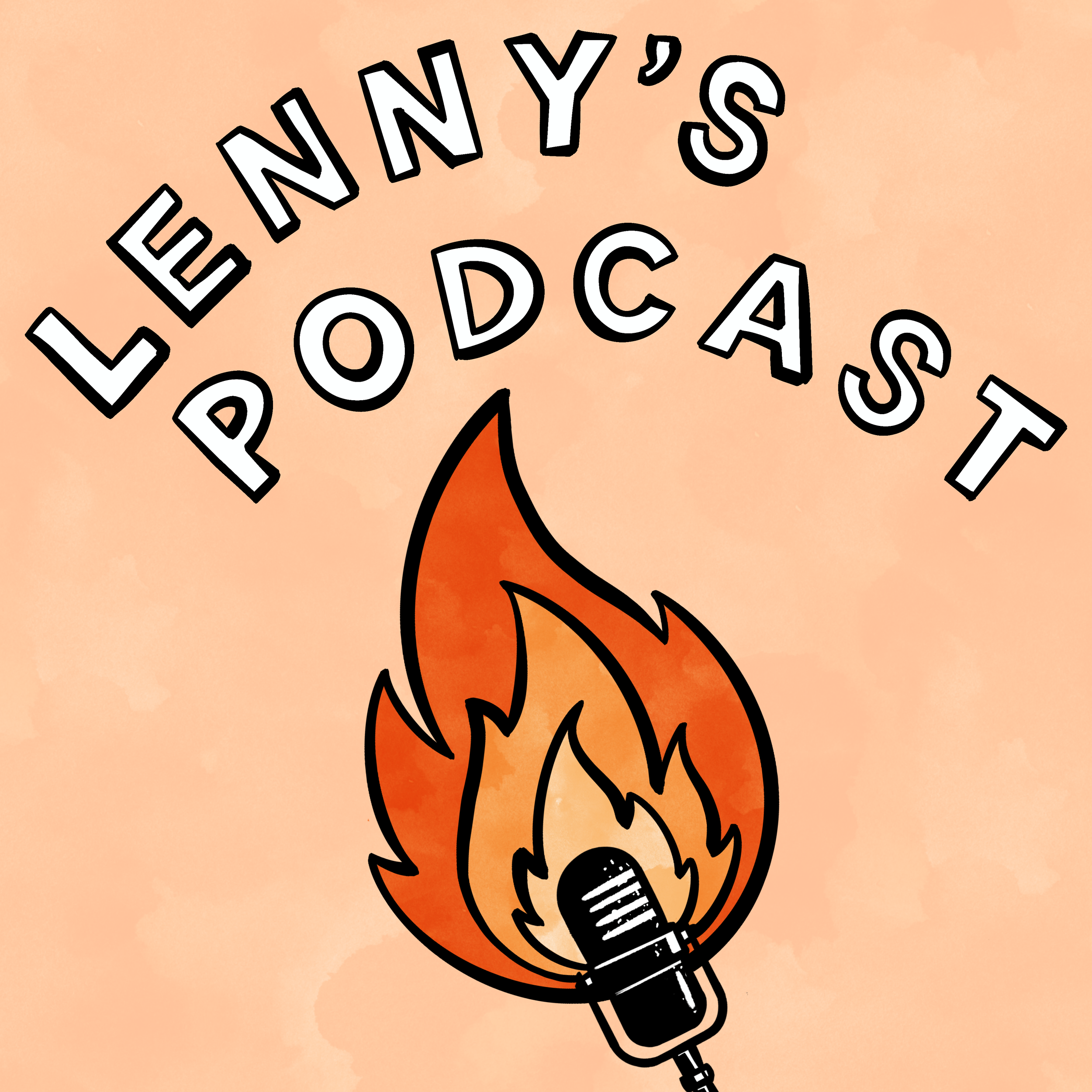
I drafted a few concepts that would try to capture that community. Early on, we decided to go with the theme of a campfire, a literal fire and a space that democratically supported conversation and collaboration. It felt warm, inviting and just figurative enough.
The campfire illustration I developed was based on loose lines and warm watercolour textures to try to break away from some of the incredibly neat vector illustrations that currently dominate tech, but while maintaining the ability to make new imagery quickly and easily.
I took that initial campfire concept and integrated it into visuals that worked everywhere from the main newsletter (working within Substack’s design constraints), Slack, social media and Lenny’s own site. That meant headers and illustrations for landing pages, logos and even a new emoji.
Once we had the brand guidelines and logo nailed, I developed a set of tools Lenny could use to put together his own more simple charts and tables. These tools included layouts for venn diagrams and tables that could be modified, arrows and shapes that could be added to other images, and icons that could be added to any of the former. This toolkit gave Lenny the freedom to quickly put together imagery that was on brand.


The final product
The campfire and consistent visuals have elevated Lenny’s already brilliant content, making it easier to share and more instantly recognisable. I’m proud that it’s a visual brand he’s proud of.
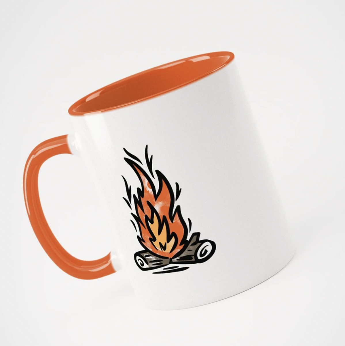
The brand has now expanded beyond the newsletter to merch, a podcast and book.